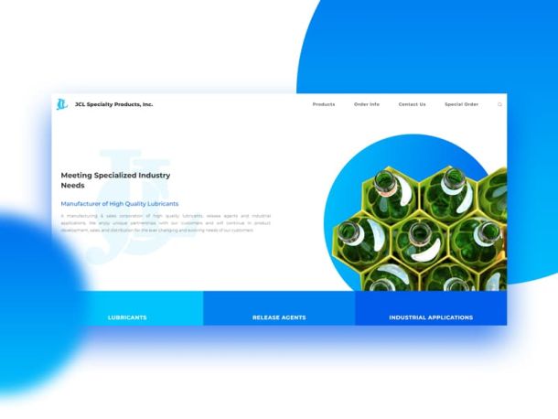
Your Header Image Will Grab Their Attention
 What is the first thing that you see when you land on a website? The answer is their header image and yet it is surprising how many owners of websites kind of forget about the important role that this one image can have in the potential success of their site.
Think of it from this point of view.
If you are walking along a street and are going past shops, what do you see? Well, you will see their shop sign and their shop window.
Now, move this thought across to the Internet. There, the domain name is basically the shop sign and the front page is the shop window. However, as the header image is the first part that you see, then this is the spot that not only has to look good, but it also needs to grab their attention or they will walk on by.
So how do you get the image that is going to be perfect for your header?
Getting Their Attention.
An image has the ability to really compliment the content. An image can be used to really help tell the story or put across a particular feeling about the site, but only if it is done correctly.
Now, this is one spot where size does not always matter as the dimensions will depend on the layout of the rest of the home page and also the look that the designer is trying to achieve. However, there are a number of things that need to be done no matter the size of the image in order to really get their attention when they land on your website.
1. Add some text.
People love to see some text on the header image. It tells them even more information than just the image itself, but you need to make sure that it does relate whether it be a welcome message or just even repeating your name.
2. Be aware of the color of the text.
One thing that is sure to annoy those individuals that land on your website and make them click off is when the color of the text is wrong and nobody can really read it. You would be surprised how often this happens as people can pay little attention to the colors in the image and where the text itself is landing. You might be able to read 80%, but that 20% can be enough to irritate people and they will go no further.
3. Adding a background to text.
Here is another option that is used by some designers and that is using the header image as an overall background for a page with the text then sitting in a block on top of it. This in itself can be a great way of doing things as it creates a sense of uniformity and some will then take it further by adopting this background on each and every page.
Of course, this is going to mean that you need to use an image that is not only relevant to your website and what it is that you do, but also is not going to be overpowering and detract attention from the content. This can be achieved by just reducing the opacity or making it black and white although other options are available.
The Difference it Makes.
When an individual lands on your website, you have very little time to convince them that they have come to the correct place and to then do whatever it is that you want them to do. If the first thing that they see is weak, outdated, pointless or anything else, then you are not making that good first impression.
However, if you can amaze them and provide them with enough information to make them scroll down, then it gives you the opportunity to really sell yourself to them.
Furthermore, a quality header image makes you seem more professional. It makes you appear as if you actually care about your website enough to have spent the time getting this first part correct. When you then tie this in with getting the correct text with the right contrast and color, then you just need to make sure that the rest of your website is up to the standard that they now expect.
What our advice is regarding the header image is to spend some time checking out what other people on their website for inspiration. Look at the sizes, how dominant the image is, what they typically show and how it relates to what they do. All of this will help you to better understand what should be on your own website and reduce the chances of you falling at the first hurdle.
Research and making sure that things are correct are key. Remember, the potential success of your entire website can rest on this.

