How Do Designers Make Unique Looking Websites?

Unless you have gone ahead and used one of those ready-made templates where you simply add in your own information, then you may be wondering how designers make unique looking websites. Well, aside from the knowledge and experience side of things, there are several other ways in which a good designer can take your brief and turn it into something that is indeed absolutely unique.

First, a designer should be able to look at your website, or ideas, and view it as a unique problem that needs to be solved. In all honesty, this has to be one of the most important points to be made because if a designer starts to view two websites in the same way, then it can lead to an amount of crossover in the design that may not be best for either website.

It can become all too easy for the web designer to fall into the trap of feeling very comfortable in what they are creating because it is the fourth construction company website that they have made in the last 12 months. Ultimately, ideas can be regurgitated, which is also not good, and there can be less of a creative flow that can ultimately hamper the final design of the website.

The best way to get around this is indeed to view each website as being a one-off problem that has to be resolved. If this is the approach that is taken, then solutions will also flow more easily, which is not exactly a bad thing.

Starting from Nothing.

A good designer will listen to your brief and then start from absolutely nothing with the design. That means it is built from the ground up because taking an existing website and then personalizing it is going to lead to that crossover issue that we mentioned earlier.

If a website is constructed from point zero, then the chances of it being unique in every way is only going to be increased. It creates a certain freshness about it all and that can only be a good thing for the client.

Research is Everything.

To get a unique looking website, there has to be an amount of research undertaken to ultimately get the rough outline of the website which can then be added to as the project progresses. A designer going into a project blindly is increasing the chances of making mistakes, and that should clearly be avoided.

The designer should carry out research into the company they are working for, the market they are in, the competition, the color schemes that work well for the branding, and the key mistakes that need to be avoided. Failure to do any of this is only going to result in a relatively botched attempt to produce something that is satisfactory to the client. If you do not prepare, then you will more than likely fall back to previous designs and use them as your inspiration which can, as a result, lead to a number of parts effectively being copied.

But then, there is a point that should also be made in that you are going to find it very difficult to have something that is indeed completely unique. There will always be minor aspects that are effectively borrowed from elsewhere, but it is the overall scheme of things and the way in which they are all put together that is the key.

A designer is going to be aware of this, but they will not allow it to cloud their thinking. Instead, they will accept those aspects and continue working towards the brief in order to ultimately produce something that is unique for that client.

Even though having a template where you just add your own text is tempting, it can affect the way in which people view you as a company. Having something that is functional and delivers on what you need is the most important thing of all. So what if something is not 100% unique. If it provides to you what you need in your website, then that is key and if the designer has been able to achieve your brief and produce something that works and represents your brand, then the overall project should then be viewed as being a success.
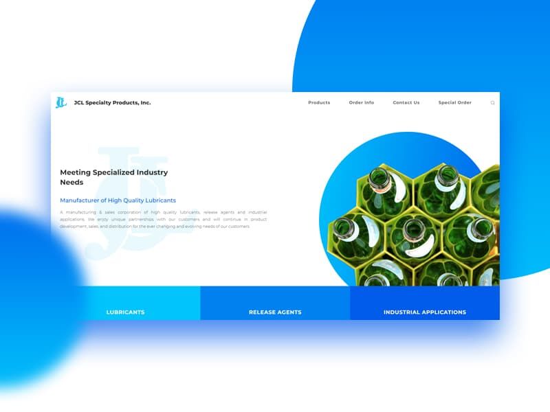
Perhaps Your Ultimate Tips For Choosing Your Color Scheme

Let’s face it, no matter how good the information or products on your website may be, people will be immediately turned away if your website is not pleasant on the eye. One major area where there is often cause for concern is with the color scheme as it’s fair to say that some schemes are rather sore on the eyes.
So, with that point in mind, you may be interested to know how you should even go about selecting your color scheme in the first place. After all, this is something that you want to get correct at the first time of asking as it is a costly business to change it later on.

Thankfully, there are several key points in mind that should make a difference.

  1. Remember People are Color Blind.

The first point is to remember that some individuals are color blind. If you use colors that are difficult for those that are not color blind to comprehend, then you are going to be eliminating a percentage of your market.

This is something that your designer can look into, but it is certainly something that has to be kept in consideration during the design process.

  1. Keep Your Audience in Mind.

When choosing colors, you need to keep your audience in mind at all times. After all, you need to choose colors that will be pleasant to them rather than making it difficult to even read what they see on the screen. This can even include looking at whether your main audience is local or international, in which case understanding the way in which different colors can be perceived culturally will also prove to be important.

  1. Remember Your Brand.

At all times you must remember your brand because there is absolutely no point in having your brand and color scheme at odds against one another. When that happens, you simply give the impression that you are not in control of what is going on with your brand and it will ultimately lead to everything appearing to be rather disjointed. Clearly, this can then have a negative impact on your brand in general, so having continuity across the board will only ever reflect well on your online presence.

  1. Create a Palette First.

There are different options available when it comes to creating a color palette before the design part is then in full swing. You don’t want to have too many different shades or completely different colors all on the one page as this makes it too busy for people to even concentrate on anything.

You are best to choose perhaps two main colors and then start to work from those two incorporating shades that blend in well with them. Look at color charts and build from that point, but do remember that you should not really have more than five colors on the one page, excluding photographs, or it can start to look messy.

  1. Create a Rough Template.

Prior to becoming fully involved in the design process, it makes a lot of sense for you to create a rough template of a page with the color scheme that you have chosen incorporated into it. With this, there will be a number of potential ways in which it can go as you may decide that the color scheme just doesn’t work at all, or you could decide that you need to cut out a color or two.

Alternatively, you may look at the template and feel that the color you had initially chosen to be your primary shade should not be in that position as something else seems to be working better. However, the good part is you have not invested a considerable amount of time and effort up until this point, so making the relevant changes will prove to be rather easy to do.

As you can see, there is so much more to selecting a color scheme for your website than simply settling on shades that appeal to you on a personal level. Instead, you need to think about things in a more widespread manner as well as being sensible with your entire approach. Color schemes make a huge difference to the way in which your website is ultimately viewed by your visitors. Remember that they will make their decision as to whether or not they will go ahead and spend money within the first few seconds, so getting the colors correct will prove to be essential.

Has Graphic Design Gone Backwards?

For a website to be successful, it relies on graphics. However, the very idea that graphic design has gone backwards somewhat is going to be rather disturbing for those individuals that are aware of the important role that it plays.

But then, is it even possible for ‘art’ to have gone backwards? Surely as long as the client is happy with what they see before them then everything else is also going to be absolutely fine?

Well, it certainly does not work that way every single time.

The problem is that graphic designers will often wish to experiment with their ideas and concepts. Now, that is the thing that pushes the industry along, but surely there has to be a line where the client and the Internet in general decides that enough is indeed enough?

Too often, the client that is having the website constructed will give the graphic designer too much space and power in deciding on what they produce. This is wrong because it can then get to a point whereby the client feels that so much work has been done that they effectively just ‘go along with it’ as they want their website to be live.

Once again, this is wrong.

You see, Internet trends tend to then force graphic design down a particular path. Social media plays a role as designers look at the kind of things that seem to catch the eye of individuals and then seek to apply those trends and concepts to their own ideas. Of course, this doesn’t always work as there is such a thing as thinking too far out of the box.

So why do we ask the question as to whether or not graphic design has gone backwards? Too often there is little interaction between client and designer whereas in the past this would have rarely been the case. There can, at times, be a feeling that they also need to throw designs out as quickly as possible as competition is so tough that the client could easily go elsewhere at any point.

Previously, there was an acceptance that quality designs took time to create. There was an entire process to be worked through from coming to terms with what the client was looking for, to coming up with the initial ideas, to finding out what the client thought of those ideas, to the final product.

In all seriousness, this would take weeks to work though on some occasions, but that length of time can often feel like professional suicide with the speed at which the web design and graphic design industry appears to be moving.

In other words, it is the pressure of competition and the desire to produce something that stands out mixed in with a willingness to push boundaries that has led to graphic design heading in reverse. It’s not to say that the designer no longer has pride in their work. That would be a crazy thing to try to argue.

However, there is perhaps a reluctance to invest as much time and energy into a design due to the pressure being applied almost from the outset. When you also add in that prices can often be driven downwards due to that increased competition, then when you are doing the same work as you did a decade ago and feel you are being paid the same; well are you going to invest as much time and effort?

The question now is what this means to the client and how to rectify the situation. Clearly, the role of the client is to give the designer the time and space to come up with something exceptional. You must communicate with the designer to let them know that you are open for ideas and interpretations, but that you are looking for specific ideas to be included. Obviously, you need to do your own research first and know what you want or else you are making life exceptionally difficult for yourself.

Perhaps then it is not the skill of the graphic designers that has gone backwards, but just a result of turmoil and pressure being applied from different angles. The need to squeeze prices down as low as possible coupled with clients sometimes having ideas that just cannot work without it looking crazy, due to them seeing something elsewhere, does not exactly help.

If space and time is provided, then there is no reason to doubt that something brilliant can be produced. It’s just a case of allowing that to happen.

Website Navigation

webnav2

Website Navigation – Get it Wrong and Your Website Will Suffer

Navigation is something that should not be overlooked, but that is often what actually happens especially when an individual seeks to make their own website using rather limited knowledge. However, poor navigation is one of the leading reasons as to why an individual will simply click away from a website that they feel is just like a maze that they cannot work around.


Now, there is actually more to a website and its navigation than just that one menu at the top because it is often the case that this is no longer enough. Instead, people are constantly looking for ways to move around a website especially after they read different points that are of interest. The last thing they want is to then go all the way up to the top because we are actually rather lazy about everything.


Make Sure Your Website is Organized.


Navigation only works well when your website is organized enough for the pages to then go ahead and flow from one to the other. However, you also need to remember that your navigation menu also has to be organized and that is where drop down navigation can work well.


With this, you need to be aware of categories where individuals will know what to expect when they move the cursor over that tab. For example, if you offer various services via your website then it would make sense for the main tab to announce that this is connected to what you have to offer followed by a drop down menu which effectively lists the different services.


At this point, people will then become aware that they can go ahead and click on a sub-tab to then learn more about that particular service. This helps them to navigate to get to the information that they are searching for which would also then make it more likely that they will, once again, do the actions that you are looking for them to do.


It Has to be Concise.


People just do not want to go ahead and spend a lot of time working their way through lists of categories to get themselves started. Being concise is important because if navigation appears to be too complicated then this is something that makes them navigate away.


There is a need to not only find the information but to do so as quickly as possible. It is also the case that as we use tablets and smartphones in order to access the Internet that these devices are just not that good at dealing with complex navigation menus. They do not work too well in offering you the ability to see all of the potential paths you can follow if you have categories followed by sub-categories and then even sub-sub-categories. That is why a search facility is going to prove to be easier for websites where there are a substantial number of pages to be included.


Remembering the Serial Position Effect.


The final point that we would like to mention here is that there is something within the realm of psychology called the serial position effect. Basically, this is where it is known that individuals will pay more attention to the beginning and end rather than anything in the middle. In other words, it would be wasted to put any navigation in the middle of a page or text as it would often be missed.


That is why we tend to put our navigation at the top of the page, but here is one piece of advice for you to incorporate. Why not also consider navigation at the bottom of individual aspects of the website?


By doing so, you provide people with further opportunities to go ahead and get to the information that they are seeking and do not for one second think that this is going to be purely for those websites that are selling products. It works for every single website.


In short, you have to spend more time getting to grips with the navigation around your website and make sure that each and every website visitor is able to get to the pages that they are looking for without having to go on a treasure hunt. Forget about one single menu bar as that is outdated. Instead, check that people can easily find whatever it is that they are looking for no matter where they are on each and every page. Not only will they spend longer on your website but they are more likely to then take the action that you want them to do.


Why a Cheap Logo is Not Always the Best

brand-logoDuring the creation of your website, it is important that you also spend some time thinking about your logo. This is vital as your logo does form an integral part of your entire branding and indeed you only have to think about several of the big name companies to understand how their logo comes to represent not only the company name but also what people then associate with it.

If you just think of the Apple logo. It is distinctive and people see it and immediately start to think of certain things such as inventions, technology and so on. The same can be said with the Nike swoosh logo as you also then start to think about different terms that are related to how you perceive the Nike brand in general.

However, perhaps the key thing is that people see their logos and instantly know the name of the brand in question. The difficulty here is that we are not really saying that the same thing will happen to your logo, but we can certainly take aspects of this and apply it to your very own situation.

So, that being said, why exactly is a cheap logo not always the best solution?

The Reasons Against a Cheap Logo.

If you search online, you will come across numerous individuals or companies that claim they can design your logo for as little as $5 and, at first, this sounds like a bit of a bargain, but is it really?

The problem with the individuals that are offering a logo at that price is that you are going to end up with something that is not really unique. You see, they use programs and templates so they can just churn out logos without too much thought being put into it and that is not the way that you want to go about this.

It is essential that your logo really is unique to you and your company. Also, the individuals that create these logos do so in such a way that you are largely unable to alter the size as you see fit. It is important to remember that logos are going to be used not only on your website but also in different forms of marketing. Failing to have a logo designed that is capable of having its size adjusted without it then looking jagged or poorly designed just cannot be allowed to happen.

In addition, there is also the very important point that you do get less of a say in your logo when you pay so little for it and this does fall into the bracket of ‘you get what you pay for’ so do keep that in mind. Ideally, you should be able to sit down with the designer, think about the colors that are in your website and all of your marketing material. Think about the image that you wish to perceive when it comes to your business and then start to put the logo together.

When you are looking at paying so little, you are pretty much just going to be giving somebody your name and they will add it to a template and then give you the apparently finished article. Now, to be honest, the only thing we can say about this approach is that it sucks. No other term can actually do it as much justice but then when you are paying $5 or $10 then do you actually have any grounds for complaint?

The Correct Approach.

Granted we have just really painted a rather dull and negative picture of these cheap logos so it is only fair to now look at what is going to be the correct approach for you to take.

First, your logo should not be the first thing that you get designed as it should really be one of the final parts of the process due to the way in which it needs to fit in with the other designs and colors that have been used elsewhere. It is a lot easier to tie in the logo with the website design rather than the other way around as the website has to be the dominant factor.

Next, you need to sit down with the designer and work through what your aims and intentions are connected to not just your logo but your branding in general. This is something that you will not have the opportunity to do with the cheaper option and yet it can be so vital to your overall success.

The only problem here is that this is going to cost you money in order to get everything right from the outset. However, its value to your business and the way in which it makes you appear more professional does mean that this will be money well spent. Just remember to design everything else first and then look at the logo just to make sure that it all fits in together perfectly.

  • 1
  • 2