Simplifying Your Website Could Be the Best Decision Ever
 By studying a range of websites, it makes it easier for you to begin to come to terms with things that are categorically wrong with so many. Often, a website can look as if it’s too crowded as if somebody has tried to put far too much information on the one page, and what is the result? A website that can be extremely off-putting.
Now, this isn’t to say that this approach will not always work for everyone, far from it. However, you need to really put some thought into all of this. After all, what do you prefer as an individual when you go to the website of any company? Do you prefer being able to land on there and feel stressed out as you simply have no idea where to look? Of course not, and who would?
That’s why the title of this blog is ‘Simplifying Your Website Could Be the Best Decision Ever’ because that statement does indeed speak the truth. In fact, it is now even more important than ever before thanks to the use of smartphones and tablets. Gone are the days where your only concern was how your website looked on a 17inch monitor and it has been replaced by something far smaller.
In other words, if your website is crowded, then how can you expect those individuals surfing it on their iPhone or whatever to then make sense of it all?
So, what could be your way forward? Well, there are several key points that are worth considering that may very well help you out of this rather difficult situation.
Use a Call to Action.
People no longer want to sit and wade through reams of information just to get to the reason why they are there in the first place. Instead, people are impatient and just want to get to that destination, so it makes sense for you to provide them with this call to action and make it as bold as possible.
This will actually increase the click-thru rate that you get and will actively encourage more people to do the action that you want them to do. It is actually crazy to think that a number of individuals will often bypass this and feel that they need to sell something over and over again. If that’s you, then stop it.
Reduce the Number of Pages.
Even if you have a lot to say, cut down on the number of pages. By simplifying things, you need to streamline as much as possible, so that’s where the likes of bullet points and bringing things together under common categories will work well.
For example, say you have a number of services. Some people would go ahead and have a different page for each service, but that is like web design suicide now. Instead, it would all go under the one banner of ‘Services’ with a brief summary of each thing all on the one page.
Don’t Get Fancy with Navigation.
There has been a recent trend to have all kinds of fanciful navigation methods, but that’s only going to complicate matters. This is especially true when they have included hidden menus because people will just get fed up trying to find something and go elsewhere.
The best approach is the old tried and trusted menu. People know what to expect, and they know how to work it so you really are onto a winner with this.
Be Careful with Typography.
There are a number of websites that seem to be in some kind of competition to use as many different fonts as possible on the one page. However, that’s just sore on the eyes and the website itself actually looks a mess.
You are best to stick to a rule whereby the fewer the number of fonts, the better it is. In general, try to have just two or three and mix it up by using some in bold, italics, or using h2, h3 and so on. There’s just no need to try to be all artistic like this as it just annoys people and makes your website look far more complicated than it actually is.
Remember the Text Size.
The final thing we will mention is the text size. It must be easy to read, and yet some people will have a font size that is far too small so that when it’s transferred to a smartphone it becomes impossible to ready it.
Increase the font size by a few points and cut back on the number of words instead so it no longer seems as cramped. Be succinct with what you are saying and get your point across as quickly as possible as that will only bode well for your potential conversion rates.
These are just a few things that we feel anybody should look at doing with their website, and it’s up to you as to which ones you need to use in order to make those changes. A simple website is a winning website and surely you want to be a winner?
 It’s not exactly rocket science to know that launching your website is going to prove to be a key moment, but even though this is obvious, it’s still amazing how many people do it wrong.
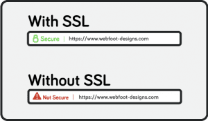 An SSL (Secure Socket Layer) encrypts data to allow secure connections from a web server to a browser. The SSL helps to keep prying eyes from seeing the conversation between you and the website you would be doing business with. In the past, an SSL was commonly needed to protect credit card information, social security numbers, bank accounts, and any other personal sensitive information. It is always expected that any online store, bank, job application, or doctor’s online patient forms have the well-known green lock displayed next the website URL.
 It would be wrong to suggest that ‘responsive web design’ is a buzz term because it has now been around for two years and ever since Google made a huge shift towards mobile and tablet usage. However, there are still various websites that just do not incorporate this into its design and that, in this day and age, is a major sin.
 How long has it been since you last made changes to your website or even added new content? The ever changing search algorithms know. Do you know if you do not change content, design, or the structure of your website on a continual schedule you become less relevant to the search engines and in turn you are found less often when paying customers are looking for your particular services or products. Our website at Webfoot is no different so we have just completed our new website redesign with all the current and latest enhancements.